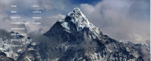
1. Header: This component is located at the top of the website and is displayed on all pages of the website
For example, a website often has a logo and many pages such as homepage, introduction page, event news, shopping cart icon
+ Logo: is the representative image of the website
The image quality of the logo is beautiful to create a beautiful website.
The logo is aligned, easy to see and clearly displayed with appropriate sizes.
The logo icon is suitable to be placed on the background color of the header
For example: Align the logo at all sizes to see if the image is clear or not and do not place a low resolution logo icon on a header background color that is too dark.


+ shopping cart icon: for normal sales websites, there will be a shopping cart icon placed on the right corner. When clicking on the shopping cart, information is displayed such as: quantity, selected product, total price
For example: Design icons with clear colors and images to avoid confusing icons or icons that are too small for the website.

![]()
2.Content: This element is usually placed below the header
+ Slider: will be seen when entering the website for the first time, mainly images, including many different photos but not all displayed on the website. The slider will have navigation buttons that can move through other slides. Additionally, slides can be videos
Note: the slide should be designed with a self-moving effect so that users can easily observe and click on it.
– Banner: usually an image, eye-catching design, common banner locations are at the top of the page (on the header) or in the column division.
* For example: banners have slider form. It is necessary to design banners with creative and new content and forms to attract customers, avoid stereotypical and boring advertising models, web advertising banners should be placed right. Have content related to the product/service you are providing.


– Web page content section: In the cells subdivided into other cells to suit different web sites.
+ Regular cells contain the main content displayed. Usually just the profile picture, title, and a few description lines of the article.
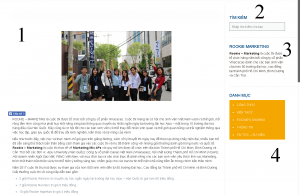
- No.1: Pagination: introductory article
- No.2: Search title and default search font
- No.3: Rookie Marketing title and description
- No.4: Category Title and displayed items
3.Footer: Located at the bottom of the website and displayed on all pages of the website. Footer often contains the following components: news – events, introduction, contact, support
For example, the footer needs to have enough information to avoid leaving the footer with too much space or dividing the column too little and can replace the information with an icon if necessary (facebook, Instagram…)

